
Es war ein kalter Wintertag und ich genoss eine Tasse warmen Kakao in einer flauschigen Decke, mit meinem Mac auf dem Schoß. Ich suche nach Schriften, die mir gefallen und die ich in meinen nächsten Projekten verwenden würde. Nachdem ich ziemlich lange geblättert hatte, beschlich mich die leise Ahnung, dass ich nichts finden würde, was mir gefiel und was ich benutzen würde. Ja, jetzt könntest Du sagen, wovon redet der überhaupt, es gibt doch Millionen von Schriften und so viele tolle. Du hast natürlich recht, aber es gibt immer ein paar Details, die mich stören. Manche Lettern sind zu breit, manche zu dick, manche zu stylish und andere haben keine Persönlichkeit. Also dachte ich, es wäre doch großartig, wenn es mir gelänge, eine Schriftart Undeka zu entwickeln, die mich glücklich macht und dabei auch noch die Grundprinzipien wiedergibt, nach denen ich gesucht habe.
Ich beschäftige mich nicht zum ersten Mal mit Schriftdesign. Ich und mein Freund Gatis hatten letztes Jahr unsere eigene Schriftschmiede wildtype gegründet und waren schon mit den ersten Fonts sehr erfolgreich. Einer davon war Besom, der andere Sunn von Gatis.
Warum sollte man also eine neue Schriftart entwickeln? Es gibt schließlich Millionen von Schriften und darunter so viele großartige. Ja, korrekt, aber es gibt immer Details die mich stören.
Besom und Sunn wurden in den ersten Monaten mehr als 2000 mal heruntergeladen. Wir wussten also, dass wir auf dem richtigen Weg waren und dass nicht einfach aufhören konnten. Wir haben schon an vielen Schriften gearbeitet, aber keine von ihnen war so solide, klassisch und sauber geschnitten wie die, die ich im Kopf hatte. Die meisten von ihnen waren von Hand gepinselt (‘handbrushed’). Weil wir wussten, dass der Stil funktionierte und er den Leuten gefiel, machten wir weiter und schufen noch viel mehr.
Die ersten Schritte brachten mich dazu, über die Herangehensweise nachzudenken, denn eine serifenlose Schrift hat viele Grundregeln, die im Entwicklungsprozess berücksichtigt werden müssen. Wie jeder andere auch, habe ich erst mal recherchiert, was das Wörterbuch über Sans / Sans Serif aussagt. Wikipedia sagt: “a sans-serif, sans serif, gothic, or simply sansletterform is one that does not have extending features called “serifs” at the end of strokes.” bezeichnet. Ganz genau, aber diese Definition gilt nur für den Vergleich mit den Serifenschriften. Ich sammelte weitere Beispiele von Schriften und Details, die mir gefallen, eine davon war Franklin Gothic und die News Gothic. Der Stil bestimmter Buchstaben war hier sehr interessant.
Dann begann ich, Ideen zu skizzieren und Details festzuhalten, die für mich interessant waren. Buchstabenendungen, Formen, Stile, um eine Vision des Gefühls und der Persönlichkeit zu bekommen, die ich mit dem Font entwickeln möchte. Irgendwann war dann die erste Etappe geschafft und ich wusste, wie sich die Type anfühlen und für was sie stehen sollte. Sie musste einfach sein, sie musste lesbar sein (naja, das ist sowie ein Muss) und sie musste eine Persönlichkeit haben, um sich von der riesigen Masse abzuheben.
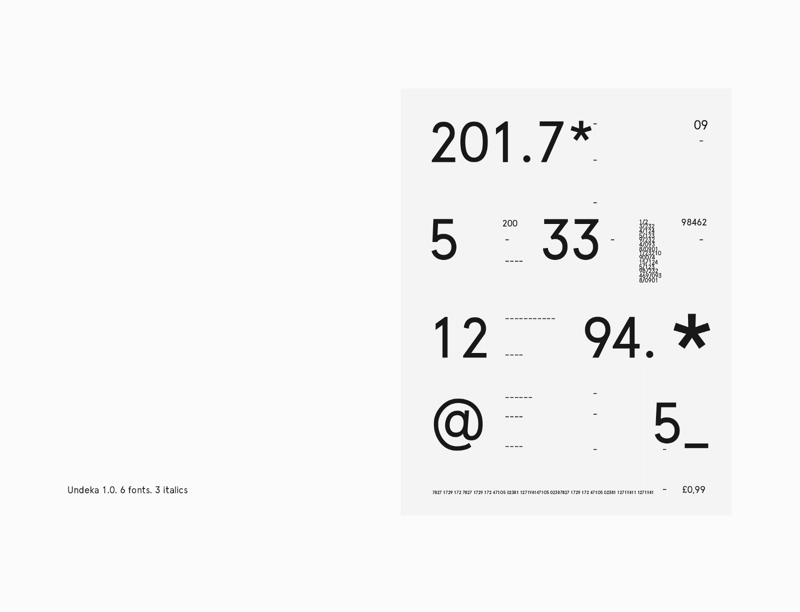
Als ich anfing, die Buchstaben zu gestalten, konzentrierte ich mich darauf, sie dahin zu bringen, dass sie sich wie eine einheitliche Familie anfühlen. So schlicht wie möglich, je einfacher, desto besser und auch leichter. Auch die Weite der Schrift war sehr wichtig. Undeka – Das heißt ‘elf’, so viele Monate hatte ich für die Erstellung der Schrift gebraucht. Mein subjektiver Blick ließ mich erkennen, dass die meisten Schriften einfach zu breit sind: die Buchstaben fließen zwar flüssig zusammen, aber sie fühlen sich nicht so schön an, wie ich es mir gewünscht hatte. Also habe ich versucht, die Buchstaben etwas schmaler zu gestalten und die Sperrung zwischen ihnen etwas größer zu halten, damit der lesende Blick organisch fließen kann.
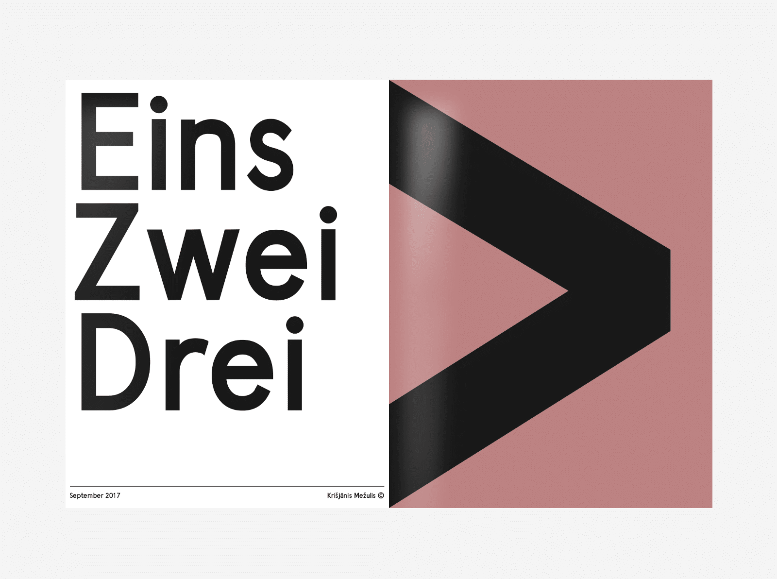
Da die Schrift einen Charakter haben musste, bekamen einige Buchstaben eine persönliche Note. Wie zum Beispiel der Buchstabe K und das kleine k. Beide bilden ein einzigartiges Muster von Struktur und Gesamthöhe. Das Gleiche gilt für das g und das G, die beide einzigartige Details gemeinsam haben. Das kleine g verläuft sanft durch das obere ‘o’. Und das große G zeigt mit dem > auf den nächsten Buchstaben, um die Lesbarkeit zu erleichtern, beide führen das Auge zum nächsten Buchstaben.
Nach etwa einem Jahr Entwicklungszeit war ich mit dem Ergebnis Undeka zufrieden. Meine Bemühungen hatten mich zu einer Schrift geführt, die ich als solide zeitgenössische serifenlose Schrift bezeichnen konnte. Die Form des Fonts hatte sich im Laufe des Prozesses verändert und verschmolz nun zu einer Ganzheit. Nach den Maßstäben von Typografiebüchern könnte man jeden Tag etwas daran kritisieren. Aber das ist für mich der springende Punkt. Mein Ziel war ja nicht, eine weitere Helvetica zu schaffen, sondern etwas Neues; Etwas, das auffällt und gleichzeitig nicht auffällt. Eine Schrift mit Persönlichkeit die in die Zukunft weist, meine persönliche Vision einer zeitgemäßen und zukunftsweisenden typografischen Arbeit.
Von Krisjanis Mezuls


It’s not like it’s the first time for me to get myself involved in type design. Me and my friend Gatis had started our own type foundry — Wildtype a year before and had huge success with the first fonts we had made. One of them was Besom (made by me) the other Sunn by Gatis.
Why would you create a new font? There are millions of fonts out there and so many great ones. Yes, I agree, completely, but there are always some details about them that bother me.
Both were downloaded more than 20 00 times in the first months. So we knew we were on to something, and that we could not stop there. We worked on many fonts, but none that would be as solid, classical and clean cut as the one I had in my mind. Most of them were hand brushed. Knowing that the style worked, people liked them we continued to create many more.
Getting started got me thinking how i shall approach this, because a sans serif font has many ground rules that need to be considered in the development process. As anybody would do, I researched what the dictionary says about sans / sans serif. Wiki says “a sans-serif, sans serif, gothic, or simply sansletterform is one that does not have extending features called “serifs” at the end of strokes.” Quite precise, but this definition takes in action only the comparison to the Serif fonts. I gathered more examples of fonts and detail I like, one of them was Franklin Gothic and the News Gothic. The style of certain letters was very interesting.
Then I started to sketch ideas and capture detail that was interesting to me. letter endings, shapes, forms, styles, to get a vision of the feel and a personality I want to create with the Font. Later on the first stage was done and I new what the Type had to feel and stand for. It had to be simple, it had to be readable (well thats a must) and it had to have a personality to stand out from the massive crowd.
When I started to form the letter shapes I focused on getting them to feel as a singular family. As simple as possible, the simpler the better, the lighter. The width of the typeface was very important. Undeka — Means eleven, for me that was the time in months needed to create the Typeface My subjective view led me to think that most fonts are just to wide, the letters flow together smoothly but they don’t feel as beautiful as I want them to be, so I tried to create the letters a bit narrower, and making the gap between them slightly bigger, allowing the eye to flow naturally.
Since the font had to have a personality some letters got a personal touch. As for example the letter K and small cap k. They both form a unique pattern of structure, and overall height. The same goes for the g and G, both share unique details. The small g flows through the top o smoothly. And the big G points with the > to the next letter to ease the readability, they both lead the eye to the next letter.
After about a year of development I was pleased with the result Undeka. My efforts had led me to a Typeface that i could call a solid contemporary sans serif. The form of the type had changed of the the process and it now merged together into a singular unity. By the standards of typography books you could fault it every day. But that is missing the whole point. I did not set out to create another helvetica, the goal was to make something new, something that stands out and at the same time not. A typeface that has a personality and a view of the future. A personal vision of a modern and perspective typographical piece.
By Krisjanis Mezuls


Bildquelle: Krisjanis Mezuls / Undeka Typeface

1 Kommentare
Lars / LGK
Wirklich interessant, die Entstehungsgeschichte einer Font zu erfahren.