Ein serbischer Designer will die Flagge der Republik Serbien modernisieren. Das Update der Visuellen Identität soll zwar auch zukünftig auf das historische Erbe verweisen, aber überholte heraldische Symbolik vermeiden. Kein einfacher Job, wie das Interview mit Vladan Pavlović zeigt.
Es ist eher ungewöhnlich, dass das visuelle Erscheinungsbild eines ganzen Staates einem gründlichen Re-Design unterzogen wird. Was war Deine Motivation Dich dieses Falles anzunehmen. Ich vermute, dass es dafür einen ganzen Strauß von Gründen gegeben hat…
“Die Serbische Flagge wurde schon häufig geändert. Seit 1835, als die erste Flagge in den pan-slawischen Farben auftauchte und seitdem wurde die Flagge von Serbien noch sieben Mal verändert. Die Flagge, wie Serbien sie heute benutzt, wurde 2004 eingeführt, aber 2010 dann zusammen mit dem Staatswappen überarbeitet. Und das ohne die Meinungen von Experten gehört zu haben und ohne öffentliche Diskussion. Es waren keine großen Änderungen und sie basierten hauptsächlich auf den gleichen monarchistischen und christlichen Symbolen.

Durch den Beibehalt der Symbole des Byzantinischen Kaiserreiches hatte Serbien Aspekte einer fremden Identität (einschließlich derer von anderen Staaten, die ihre Dominanz und Macht demonstrieren wollten) und haben so die staatliche Identität Serbiens verloren. Vier Länder nutzen ähnliche Symbole mit einem Doppeladler als größtem gemeinsamem Nenner: Serbien, Montenegro, Russland und Albanien. Symbole aus Wappen hatten im Mittelalter durchaus ihre Berechtigung weil sie sich historisch auf Christentum und Monarchie bezogen. Die Wappen und Flaggen haben sich allmählich verändert, die Monarchie analog mit der Politik und Kultur der serbischen Gesellschaft in welcher sie geschaffen worden waren. Heute werden wir gegenüber der Welt dargestellt, als ob wir immer noch von autokratischen und orthodoxen Führern geführt würden. Aber weil unser Staat säkular und demokratisch ist, verdient er auch Symbole, die ihn angemessen repräsentieren. Serbien hat ein großes Potenzial um traditionelle Symbole aus seinem kulturellen Erbe zu nutzen, die aber nicht zu anderen Nationen gehören und nicht der staatlichen Politik zuwiderlaufen.
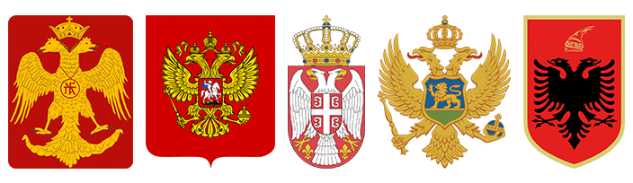
Der Doppeladler – Das Wappentier der Palaiologen Dynastie
Auf dem Balkan gibt es das Phänomen, dass Flaggen europäisiert werden, wie zum Beispiel im Kosovo und Bosnien und Herzegovina. Seit neuerem trägt die Flagge der Region Vojvodina drei gelbe Sterne und verweist damit auf die Flagge der EU.
Aktuell entfalten Politiker einen Flaggenkult, der große öffentliche Kritik ausgelöst hat, besonders weil er als seinen Höhepunkt einen 210 Meter hohen Flaggenmast hervorgebracht hat. Der soll in Belgrad aufgestellt werden, so wie auch schon in Ländern des Mittleren Ostens und Asien. In Serbien wird eine Menge Steuergeld ausgegeben für verrückte Projekte, die für das Volk völlig unwichtig sind, während alle serbischen staatlichen Einrichtungen in Trümmern liegen.
Die größte Kraft liegt in der Idee. Serbien hat ernste Probleme und ich glaube dass die neue visuelle Identität Änderungen in einem positiven Licht erlauben würde. Flaggen waren immer Teil einer Kultur der Gewalt, müssen das aber eigentlich nicht mehr sein. Wir als Bürger müssen den ersten Schritt machen und unseren Nachbarn zeigen (die ja auch problematische Symbole haben), dass wir mit unseren serbischen Symbolen des Friedens einzigartig sein können und mutig genug um uns Hass und Ungerechtigkeit von Seiten politischer Parteien entgegenzustellen – zugunsten von Freiheit und einer besseren Zukunft!”

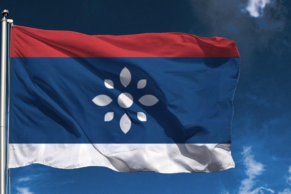
Alt: Die aktuelle serbische Flagge

Zivile Flagge und Standarte
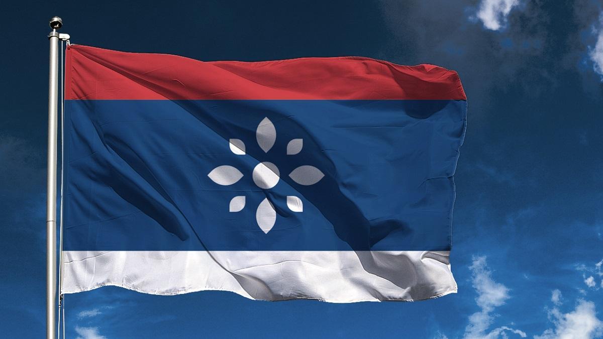
Vorschlag: Die serbische Staatsflagge
Wie waren die bisherigen Reaktionen? Konntest Du auch konservative Mitbürger/ Politiker/ den Klerus für Dein Projekt begeistern? Entschlüsseln die Menschen Deine Formsprache? Werden sie eine neue Gestaltung akzeptieren und ihre liebgewonnene Symbolik loslassen?
“Die Reaktionen waren ziemlich vorhersehbar. Die Menschen haben sich an schlechte politische Veränderungen im Lande gewöhnt weshalb jede positive Initiative beargwöhnt wird. In Serbien gibt es viele Medien unter der Kontrolle politischer Parteien, die die Menschen fehlinformieren, weshalb das Projekt negativ dargestellt wird. Natürlich, manche haben das Projekt unterstützt, weil sie der Meinung sind, dass sich die aktuellen Symbole nicht für eine säkulare demokratische Republik eignen und dies eine positive Reaktion auf den Fortschritt einer Identität der Serbischen Republik ist. Bis jetzt haben weder die Serbische Orthodoxe Kirche noch Politiker die Projekte kommentiert.
Glaubt man den Umfragen, dann wurde das Symbol der Rosette mit Blume, Sonne, einem Stern, Eintracht und Licht assoziiert. Das Symbol ist also erfolgreich in seiner positiven visuellen Kommunikation. Es wird schwierig sein, irgend etwas zu verändern weil der gesamte Staat von politischen Parteien und individuellen Politikern betrieben wird. Die Bürger können keinen Zugang zur Wahrheit haben, kein kritisches Denken entwickeln für ihr bürgerliches politisches Engagement, weil die Massenmedien falsch informieren, einschüchtern und bestechlich sind.
Dies alles schafft eine politische Apathie weil der Bürger das Gefühl hat, dass er keine Macht hat um zu entscheiden und die Meinungsfreiheit ausgelöscht und zerstört wird. Das wiederum führt zu einer großen Abwanderung junger Leute, einem ‘Brain Drain’ aus Misstrauen gegenüber dem Staat und seinen Institutionen.
Das alles bedeutet aber nicht, dass wir garnichts tun sollen! “The only thing necessary for the triumph of evil is for good men to do nothing”, sagte schon der Philosoph und Staatsmann Edmund Burke. Dieses Projekt liefert eine schöne Inspiration für ein Engagement um die Dinge für Serbien und seine Bürger zum Besseren zu wenden.
Designer haben eine Verantwortung für die Gesellschaft, weil sie die Macht haben Informationen Form zu geben, Identitäten zu erschaffen, Menschen zu verbinden und für eine erleichterte Kommunikation zu sorgen. Oftmals arbeiten Amateurdesigner in staatlichen Verwaltungen die die Kommunikation nur erschweren, fehlinformieren und eher schädliche Erscheinungsbilder schaffen. Es ist deshalb notwendig eine neue Kommunikation zu etablieren, die auf den Ideen von Frieden, Demokratie und Toleranz basiert, und genau dafür steht das Symbol der serbischen Rosette.”

Die ‘Rosette’ – Ein Symbol der serbischen Identität
Welche Elemente hast Du hinzugefügt (und warum), um den neuen Aspekten des modernen Serbien gerecht zu werden?
“Als prominentestes Symbol habe ich die Weiße Rosette eingeführt, die auch die serbischen Führer des Mittelalters getragen hatten. Serbien hat eine lange Tradition der Ornamentik, am sichtbarsten in Architektur und Malerei aber auch in der Kleidung, in Alltagsobjekten und Buchgestaltungen ist… Blumenornamente, Pflanzenranken und Flechtwerk sieht man häufig, darunter auch das Symbol der Rosette, die in vielerlei Ausprägungen genutzt wird. Die Weiße Rosette steht für Leben, Einheit, Frieden und Eintracht.
Aber ich habe auch das Tetragrammkreuz ‘Ocilo’, das Emblem der byzantinischen Palaiologo-Dynastie überarbeitet. Duch das redesign wurde es ein serbisches symbol mit dem vierfachen kyrillischen Buchstaben C, der für das Motto “Samo Sloga Srbiju Spašava” (Nur Einigkeit rettet Serbien) steht. Jetzt schließt das Motto ALLE Bürger Serbiens mit ein, nicht nur die Bürger mit serbischer Nationalität.”

Visuelle Umsetzung des serbischen Wahlspruches: “Samo sloga Srbiju Spašava”
Hast Du vorher Feldstudien betrieben?
“Serbische Designer, Künstler und Bürger waren an dem Projekt beteiligt und haben mit Fragebögen, A/B-Tests und Interviews beigetragen. Die gesamte Visuelle Identität wäre nicht machbar gewesen ohne ihre Hilfe und ich bin dafür sehr dankbar!”
Auf welchen Gebieten neben dem Grafik Design bis Du sonst noch aktiv?
“Ich interessiere mich für viele Gebiete, einschließlich den Bildenden Künsten (Malerei, Zeichnen, Photographie und der japanischen Kalligrafie ‘shodō’), für Vexillographie (Flaggendesign), Dichtung, Linguistik (Conlang) und Philosophie… Ich arbeite im Moment als Assistent für Fachkunde im Bereich Grafik Design am ‘College of Fine and Applied Arts’ in Belgrad. Es ist schwierig sich in nur einem einzigen Gebiet zu betätigen, wenn es doch so viele andere interessante Beschäftigungen gibt.”
Mehr über das Projekt: https://goo.gl/TSqEKm

Vorschlag: Das Siegel der Republik Serbien
Total Makeover of the Serbian Flag
From the Byzantine Empire Into the 21st Century
A serbian designer wants to modernise the flag of the Republic of Serbia. His proposal for an update of the visual identity of the Balkan state should still refer to the historic heritage but avoid outdated heraldic symbiolism. Not an easy job, as the interview with Vladan Pavlović shows.
It’s not that usual that the visual identity of an entire state undergoes thorough re-design. What was your motivation to take on this case? I suppose it must have been a whole bunch of different reasons…
The Serbian Flag was often changed. Since 1835, the first flag in the Pan-Slavic colors appeared, and since then, the flag of Serbia has been changed seven times. The flag that Serbia is using today was introduced in 2004, but redesigned together with the coat of arms in 2010, without having heard the opinion of the experts, and the public discussion. The changes were not major, and they were mostly based on the same symbols of the monarchy and Christianity.
By retaining the symbols of the Byzantine Empire, Serbia used aspects of a foreign identity (including identities of other states that wanted to show their domination and power), and thus lost the state identity of Serbia. Four countries use similar symbols, with a double-headed eagle as most common (Serbia, Montenegro, Russia, Albania). Symbols from the coats of arms had a good application in the Middle Ages, as they are historically related to Christianity and monarchy. The coats of arms and flags have been changed in time, the majority in line with the politics and culture of the Serbian society in which they were created. Today, with this symbols we are presented to the world as if we were still led by autocratic and Orthodox leaders. But as our state is secular and democratic, it deserves symbols that will properly represent it. Serbia has a great potential to use traditional symbols from its cultural heritage, but which do not belong to other nations, and do not violate the state politics.
Currently, politicians are developing a cult of the flag, which has met great public criticism, especially as the highlight of this represents a 120 m high flagpole that will be installed in Belgrade, as in the other countries of the Middle East and Asia. In Serbia, a huge amount of public tax money is spent on crazy projects of no importance for the people, while all Serbian institutions are in ruins.
The greatest power lies in the idea. Serbia has serious problems, and I believe that the new visual identity would allow changes in the positive light. Flags were always part of the culture of violence, but they no longer have to be. We citizens must make the first step, and show our neighbors (which also have problematic symbols) that we can be unique with our Serbian symbols of peace, and be brave to face hate and injustice by political parties, for the sake of freedom and a better future!
How are the reactions so far? Can you spark the conservative citzens/politicians/ the clergy also with your proposal? Do people decode your language of form? Will they willingly accept a new design and abandon their beloved symbolism?
The reactions were quite predictable. People have become accustomed to bad political changes in the country, so any positive action is viewed with suspicion. In Serbia there are many media that misinform people, and are under control of political parties, so the whole project is shown negatively. Of course, many people supported the project, believing that the current symbols are not for a secular democratic republic, and that this is a positive direction towards the progress of the identity of the Republic of Serbia. So far, the Serbian Orthodox Church and politicians have not commented on projects.
According to the questionnaires, the symbol of the rosette was associated with flower, the sun, a star, harmony, light… so the symbol is successful in its positive visual communication.
It will be difficult to change anything, because the entire state is run by political parties and individual politicians. Citizens are unable to assess the truth, nor to develop critical thought for their civic political engagement due to mass media misinformation, intimidation and bribery. This creates a political apathy, because the citizen feels that he has no power to decide – it is already decided for him. If courage is ever shown, it is humiliated in the media, and the freedom of thought is extinguished and destroyed. This also leads to a great departure, a migration of young people (brain drain), due to mistrust in the state and its administration.
That doesn’t mean that we don’t have to do anything! “The only thing necessary for the triumph of evil is for good men to do nothing”, said Edmund Burke. This project serves as an inspiration for undertaking initiatives for the betterment of Serbia and its citizens.
Designers have responsibility for society, because they have the power to shape information, create identities, connect people and provide easier communication. It is often the case that amateur designers work in governmental administrations, who are complicating communication, misinforming and creating harmful identities. It is necessary then to establish a new communication, based on the ideas of peace, democracy and tolerance, which the symbol of the Serbian rosette represents.
Which elements did you add (and why), to match with the new aspects of modern Serbia?
As the main symbol I introduced a white rosette, which Serbian medieval rulers wore. Serbia has a long tradition in ornamentation, which is most visible in architecture and painting, as well as in clothing and everyday objects, decorated books… Ornaments of flowers, plant curvature and interlacing are frequent, among which this symbol of the rosette is the most used in its various styles. The white Rosette symbolizes life, unity, peace and harmony.
Also, I redesigned ocilo, which is based on the tetragrammatic cross emblem of the Byzantine Palaiologos dynasty. Through redesign it became a Serbian symbol with four cyrillic letters C, which visually represents the motto “Samo Sloga Srbiju Spašava” (“Only Unity Saves the Serbia”), which I also changed (current motto is “Only Unity Saves the Serbs”). Now the motto includes all citizens of Serbia, not only the citizens with Serbian national affiliation.
Designers, artists and citizens of Serbia participated in the project, helping with questionnaires, A/B tests, interviews… The entire new visual identity would not be possible without their help, and I am very grateful for that.
In which fields other than graphic design do you work?
I have interests in many fields, including visual art (painting, drawing, photography, Japanese calligraphy – shodō), vexillography (flag design), poetry, linguistics (conlang), philosophy… I am also currently working as an assistant in graphic design department in the College of fine and applied arts vocational studies in Belgrade. It’s hard to work in just one field, when there are so many other interesting activities to do.
Find out more about the project: https://goo.gl/TSqEKm


1 Kommentare
Roland Scheil
Sehr guter, mutiger Ansatz. Finde ich formalästhetisch sehr gelungen, da sich ein punkt- oder achsensymmetrisches Symbol immer besser einprägt als eine »freie« oder überfrachtete Form. Bin aber sehr gespannt, ob das jemals umgesetzt wird.