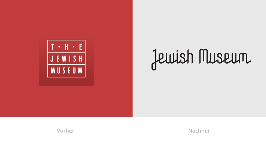
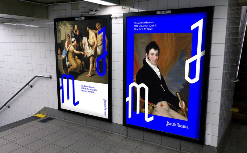
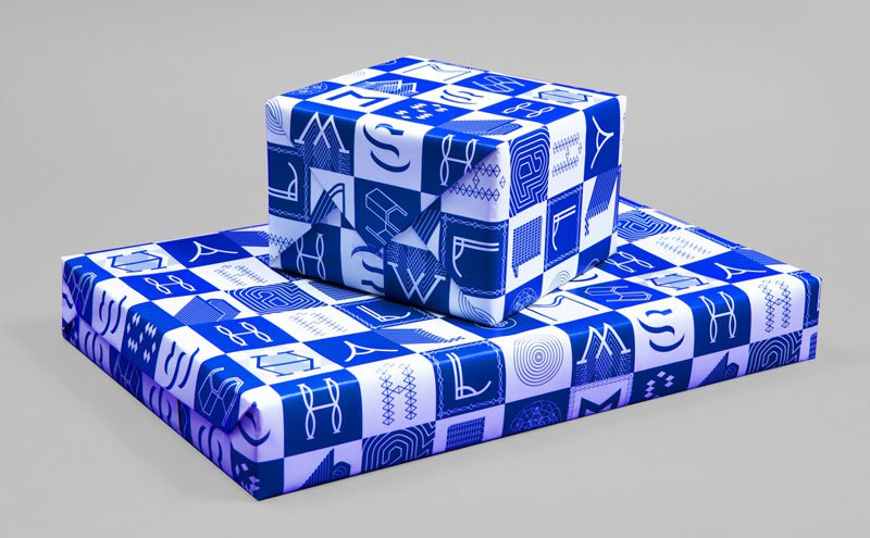
Das »Juwish Museum« hat eine neue grafische Identität von Sagmeister & Walsh bekommen. Die Design-Firma aus New York City besteht aus Stefan Sagmeister und Jessica Walsh, welche für ihre experimentelle Typografie und markante Bildsprachen bekannt sind. Alle Elemente von diesem Design bestehen aus dem gleichen Raster, und zwar dem Davidstern. Gemischt wird das dann mit eleganter, zeitgenössischer Ästhetik.
Sie sehen gerade einen Platzhalterinhalt von Standard. Um auf den eigentlichen Inhalt zuzugreifen, klicken Sie auf den Button unten. Bitte beachten Sie, dass dabei Daten an Drittanbieter weitergegeben werden.
Sie sehen gerade einen Platzhalterinhalt von Standard. Um auf den eigentlichen Inhalt zuzugreifen, klicken Sie auf den Button unten. Bitte beachten Sie, dass dabei Daten an Drittanbieter weitergegeben werden.
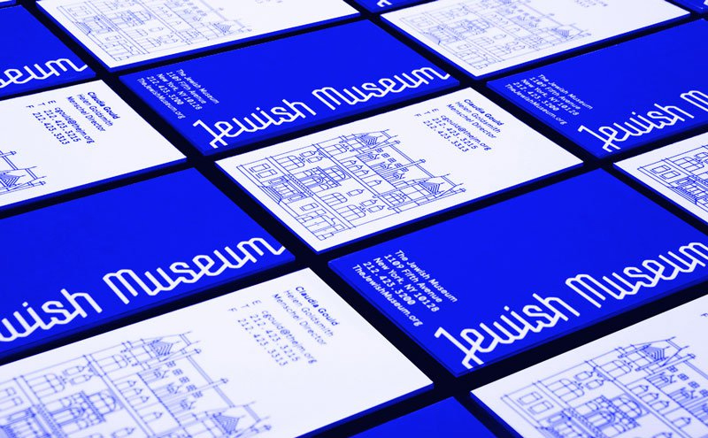
The Jewish Museum didn’t want just a tweak. They asked Sagmeister & Walsh to rebrand the museum’s entire graphic identity, from its website to its logo to its giftwrap. Ultimately, and perhaps surprisingly, Sagmeister & Walsh settled on the principles of sacred geometry, an ancient visual system related to Jewish symbolism, as guidelines for every aspect of the branding. The identity is rendered mainly in Jewish colors: bright blue and gold.


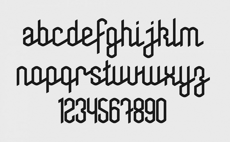
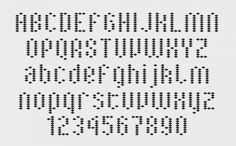
Our goal in rebranding the museum was to connect the historic and contemporary, and engage multiple visitor generations. The new identity system we created is founded on ‘sacred geometry’, an ancient geometric system from which the Star of David was formed. The entire branding system is drawn on this grid, from the word and logo mark, to dozens of patterns, icons, typography, and illustrations. To address photography as part of the system, we built a processing app that turns a photo or webcam stream into a Jewish Museum illustration.


0 Kommentare