Architecture has a lot to do with good taste. So does Coffee.
Good architects have visions and philosophies. So does Kaffeepur.
Architects design buildings. Coffee roasters create blends. A good match.
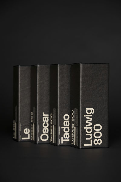
While studying the philosophies of four select classics among architects, I knew immediately which coffee beans to pick in order to create a blend that would match the intentions of those four architects exactly.
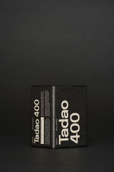
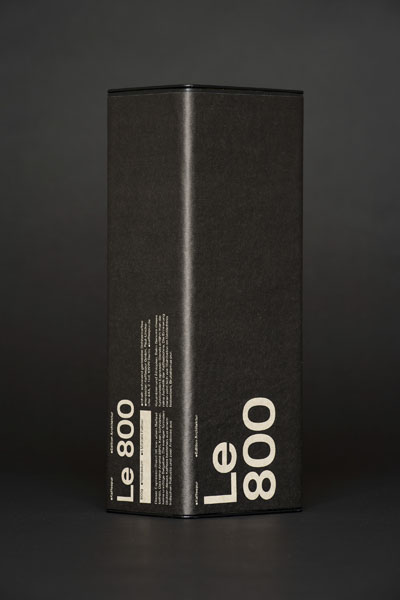
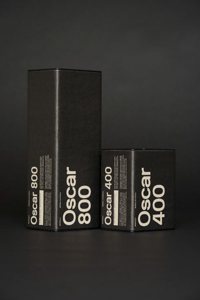
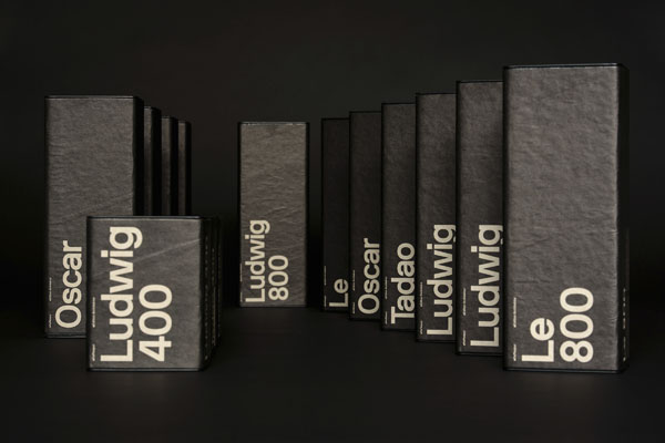
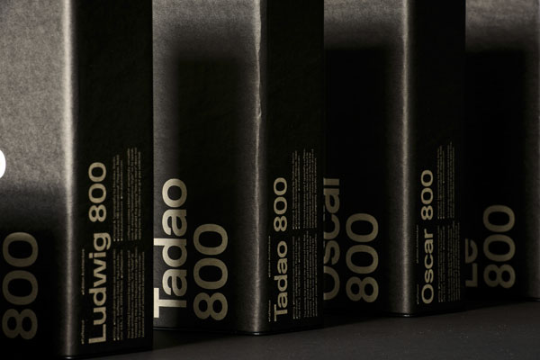
And in a uniquely Berlin way, it just so happens that the well-known graphic designer, Stefan Gandl of Neubau Berlin, is working next door and agreed to design our new Coffee-Architecture packaging with his newly developed typeface NB-International (TM). Perfect.
»Standard« simply doesn’t work in an architectural office! Up to now you could only store your coffee in common, regular retail tins. A stylistic no-no par excellence displayed next to usually beautiful, expensive Espresso machines from Italy. Our packaging will put an end to that!
The trigger for our Architecture – Edition was the fact that we found ourselves supplying more and more architectural offices.
On our deliveries we noticed, that most of these offices made a point of treating their coffee as more than just a caffeine-injection. Instead they were conscious of the fact that really good coffee with the appropriate equipment creates a daily enjoyment and vitalizes the quality of work output, thus possessing a certain importance that can’t be underestimated.
For further information do not hesitate to contact me, I’d be happy to assist.
Enclosed you will find photographic materials that you are welcome to use provided you give attribution to photographer Phil Dera.




0 Kommentare