Re:Vision – Eine kreative Perspektive auf globale Veränderungen – Monotype, führender Anbieter für Schriften und Font-Technologien, hat die Type Trends 2025 veröffentlicht: Der neue Report mit dem Titel Re:Vision bietet Marken, Designern, Agenturen und Kreativen weltweit eine Perspektive, wie Design und Typografie den kulturellen und kreativen Zeitgeist in einer Ära beschleunigter gesellschaftlicher und technologischer Veränderungen einfangen. Die Type Trends 2025 wurden von Charles Nix, Senior Executive Creative Director bei Monotype, gemeinsam mit den Executive Creative Directors Phil Garnham und Tom Foley kuratiert. Marie Boulanger, Design Team Lead bei Monotype, war für die kreative Gestaltung des Berichts verantwortlich. DESIGNBOTE hat mit Phil und Marie gesprochen.
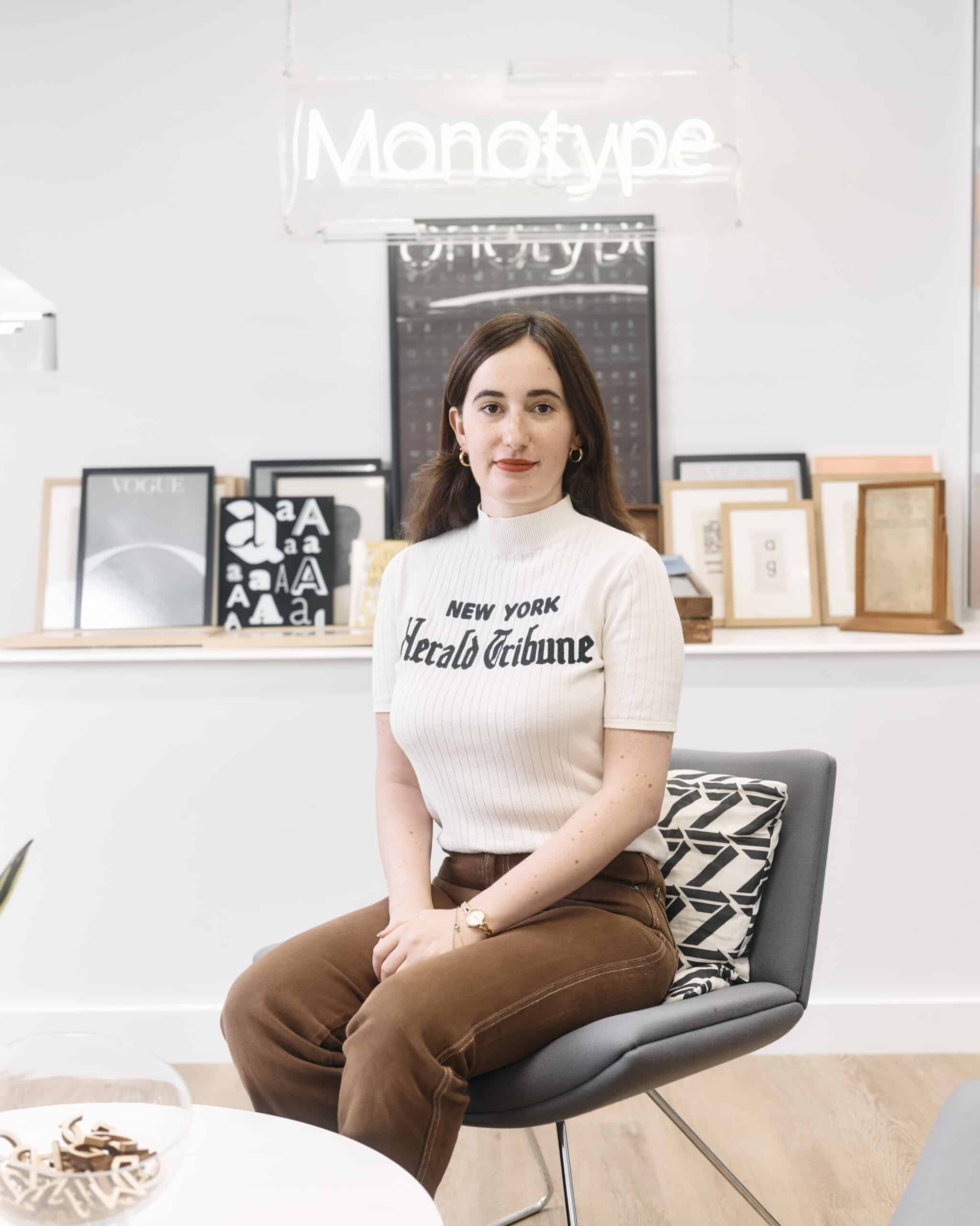
Marie Boulanger, Design Lead bei Monotype
In diesem Jahr schlägt Monotype mit seinen Type Trends eine neue Richtung ein. Re:Vision unterscheidet sich von den vielen Trendberichten, die in der Kreativszene zu finden sind. Was genau hat Sie dazu inspiriert, dies zu tun?
Phil: Seit dem Start unserer jährlichen Trendberichte hat sich die kreative Landschaft erheblich gewandelt, doch die generelle Perspektive unserer Branche bleibt unverändert. Die Idee, dass ein Trendbericht einfach so aus dem Nichts entsteht, ist unrealistisch. Wir haben gelernt, auf die gegebenen Rahmenbedingungen zu reagieren, innerhalb festgelegter Grenzen zu arbeiten und diese manchmal sogar zu überschreiten, um Neues in die Welt zu bringen, die wir gestalten. Es geht darum, eine ‘Vision’ zu liefern. Design ist zunehmend systematischer und reaktiver geworden, weniger bewusst und herausfordernd. Es war an der Zeit, das ‘Warum’ neu zu bewerten und kritische Fragen über unsere Rolle bei der Gestaltung der Zukunft und die Bedeutung der Typografie in diesem Prozess zu stellen
Was ist der Ursprung der sechs Schlüsselthemen?
Phil: In den letzten drei Jahren haben wir eine Vielzahl von Themen aus allen Lebensbereichen gesammelt, doch besonders sechs davon haben sich als zentral herauskristallisiert. Diese großen Themen bestimmen unsere reale Welt – hier und jetzt. Es war an der Zeit, die Fragen zu stellen: ‘Was können wir tun?’, ‘Wie können wir uns selbst ermächtigen, aktiv zu werden?’, ‘Wie kann unser kreativer und strategischer Beitrag die Entscheidungen unserer Kunden beeinflussen?’. Design ist Macht. Schrift beeinflusst alle Formen von Sprache und Kommunikation. Wir möchten erforschen, berichten und den Dialog weiterführen. Unser Report soll sagen: ‘Hey, wir sind Monotype. Lasst uns sprechen. Lasst uns gemeinsam Lösungen finden.
Monotype möchte diese sechs Themen mit kreativen Partnern erforschen. Wer sind sie und was genau ist geplant?
Phil: Oooh … das würde ja alles verraten! Unsere erste Aktivierung, ‘Sound & Vision’, erforscht das Konzept der typografischen Synästhesie. Dieses Konzept besagt, dass unterschiedliche Medienformen Gefühle und Sinneswahrnehmungen in verschiedenen Medien hervorrufen können. Die faszinierende Vorstellung, dass wir Klänge sehen und Schriften hören können, hat uns dazu inspiriert, mit Audiosocket zusammenzuarbeiten. Diese in London ansässige Sonic Brand verfügt über eine umfangreiche Bibliothek von Komponisten. Gemeinsam erforschen wir, wie KI die Grenzen zwischen den Medien überwinden und Verbindungen zwischen Schriften schaffen kann. Dieses Projekt wird im März auf der SXSW in Austin präsentiert. Im Laufe des Jahres folgen weitere Aktivierungen mit Partnern wie BlazeType, MuccaTypo, D&AD, CanvaWas ist Canva? Canva ist eine Online-Designplattform, mit de... More und anderen.”
Was genau können Kreative, Agenturen und vor allem Marken von den Trends lernen?
Phil: Re:Vision zielt weniger darauf ab, Lerninhalte zu vermitteln, sondern vielmehr darauf, aktive Forschung und Handlungen zu fördern. Der Report stellt Fragen, die oft übersehen oder gar nicht erst mit Typografie in Verbindung gebracht werden. Unser Ziel ist es, den Keim eines Gedankens zu säen. Unsere Aktivierungen sollen als Anleitung und Plattform dienen, um vorauszuschauen und zu erkunden, was auf uns zukommt. Sie bieten eine Spielwiese, auf der wir alle mit Offenheit Zukunftsszenarien entwerfen können.
Human Types ist ein besonders spannender Trend. Welchen Einfluss wird KI Ihrer Meinung nach auf die Kreativität und Entwicklung von Schriften haben? Wird es bald eine KI geben, die maßgeschneiderte Schriften erstellt?
Phil: Wir haben intensiv über dieses Thema nachgedacht und bereits einige Umsetzungsideen entwickelt. Monotype legt großen Wert darauf, menschliche Kreativität, das Zeichnen von Hand und den Prozess der Ideenfindung ins Zentrum des Schriftdesigns zu rücken. Wie in den Bereichen Branding und Grafikdesign ist jedoch der Einfluss der KI auf unsere Branche unvermeidlich. Unser Fokus liegt darauf, es richtig zu machen. Wir streben nicht nach einem rein technischen Wettbewerb, sondern nach einem ausgewogenen Ansatz. Ein aufschlussreiches Beispiel dafür ist unsere Aktivierung im April gzu ‘Human Types’.
Welche AI-Tools verwendet Monotype bereits?
Phil: Wir haben viel Zeit investiert, um Tools zu entwickeln, die es einfacher machen, Schriftartenbibliotheken zu durchsuchen. Ziel ist es, die emotionale Wirkung der Schriften zu erfassen und zu verstehen, wie sie sowohl technisch als auch ästhetisch zusammenpassen. Derzeit hat KI noch Schwierigkeiten mit der Erkennung von Schriften in Bildern. Deshalb werden wir bald eine Lösung vorstellen, die auch dieses Problem adressiert. Bleiben Sie dran!
Zum Schluss noch eine Frage zur Gestaltung. Es war sicher eine große Herausforderung, für jeden Trend die richtigen gestalterischen Nuancen zu finden, um dem Bericht ein visuelles Gesicht zu geben. Bitte erläutern Sie das Konzept.
Marie: Das Design-Team von Monotype hat intensiv an einem Konzept gearbeitet, das das neue Format des ‘Type Trends 2025’ Berichts optimal zur Geltung bringt. Die Kampagne ist um eine Form herum gestaltet, die wir ‘das Portal’ nennen. Inspiriert vom Doppelpunkt in ‘Re:Vision’, dient es als Symbol für die Vorfreude und ist zugleich optisches Instrument (wie ein Fernglas oder Spiegel) und ein Venn-Diagramm, das Vergangenheit und Zukunft verbindet. Für jedes Kapitel haben wir ein spezifisches Portalsymbol entworfen, das subtile visuelle Hinweise auf die behandelten Themen enthält. In dem E-Book nutzen die Kapitelüberschriften einen typografischen Effekt, der an Brechung erinnert und Vergangenheit, Gegenwart und Zukunft verknüpft. Um der Kampagne ein einzigartiges visuelles Erscheinungsbild zu verleihen, arbeiteten wir mit dem AI Director Robert Connelly zusammen und schufen eine lebendige visuelle Umgebung, vereinheitlicht durch eine beruhigende Farbpalette und hyperrealistische Bilder, die jedoch eine leicht beunruhigende Ausstrahlung haben und zum genaueren Hinsehen anregen.
Re:Vision – A creative perspective on global changes
The report presents six key-topics in which design plays a dynamic and powerful role.
Monotype, a leading provider of typefaces and font technologies, has published Type Trends 2025: the new report, entitled Re:Vision, offers brands, designers, agencies and creatives worldwide a perspective on how design and typography are capturing the cultural and creative zeitgeist in an era of accelerated social and technological change.
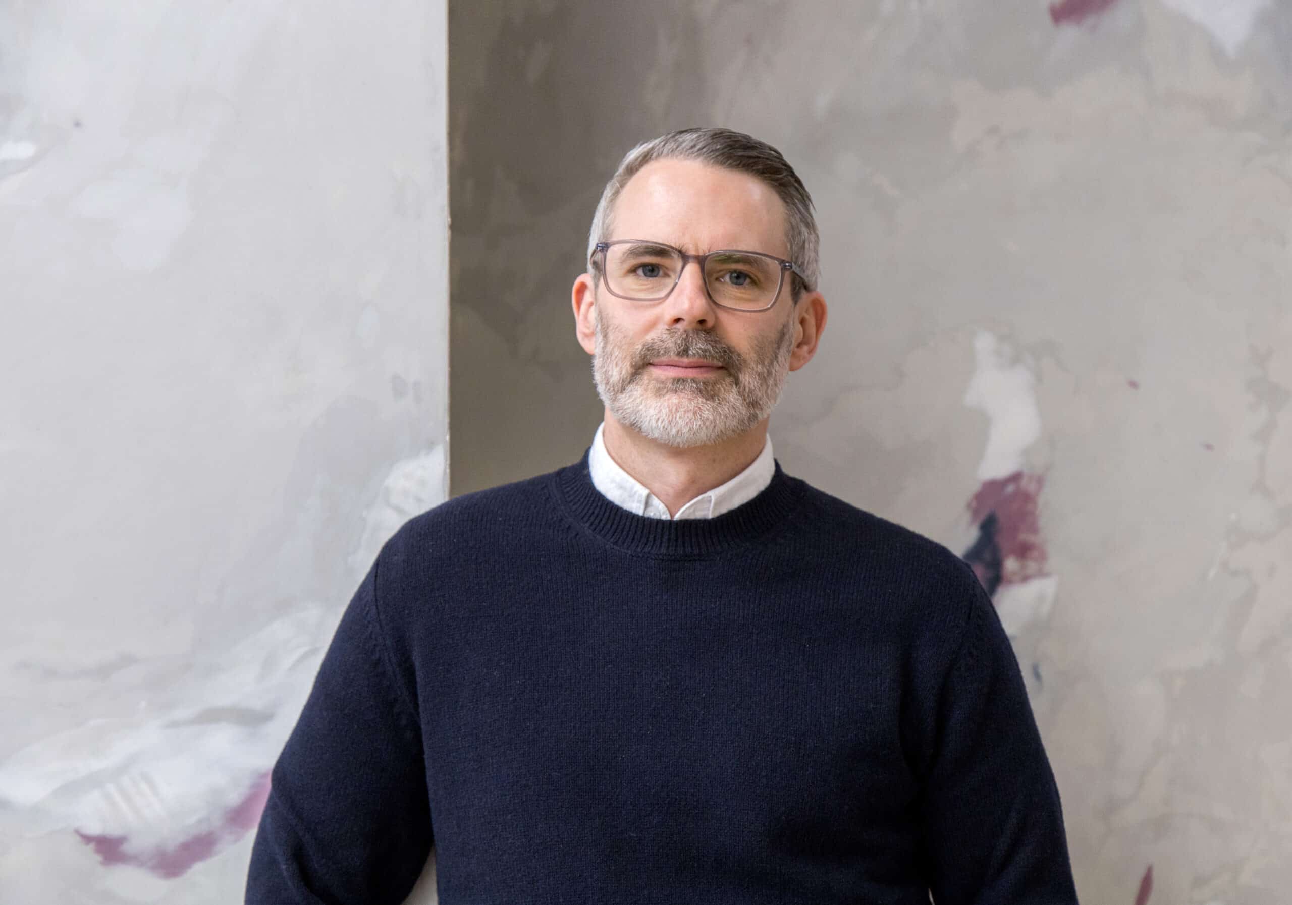
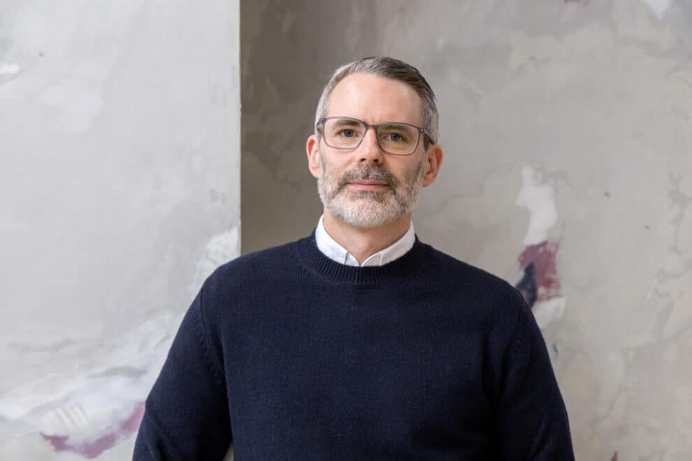
Phil Garnham, Executive Creative Director bei Monotype
This year, Monotype is taking a new direction with its Type Trends. Re:Vision is different from the many trend reports that can be found in the creative scene. What exactly inspired you to do this?
Phil: The creative landscape has changed quite significantly since the inception of our annual trends campaign, but the commentary that ‘we’, the creative industry at large, provide hasn’t. And this idea that a trending typeface ‘just happens’ out of nowhere is silly. We all learned at design school to respond to the condition of the brief, to work within their guardrails, and then to surpass them, to bring something new to the world we create, provide a ‘vision’. There has been a disconnect between creative output and ‘the why?’ our design exists or looks the way it does. Design has in many ways become systematized and reactive, less conscious and provoking. We felt it was time to reevaluate ‘the why’ and ask questions on our role in shaping the future and typography’s relationship to it.
What is the origin of the six key themes?
Phil: Over the previous three years, we gathered a collection of topics from all walks of life but what stood out most were these six themes, the big ones, the topics that really are defining our real-world condition, today, right now. The time felt right to ask, ‘what can we do?’, ‘how can we empower ourselves to take action in the role we play?’, ‘how can our creative and strategic input with customers influence their broader commercial decisions?’. Design is power, type influences all forms of language and communication. We want to investigate, report and seek further dialogue. The report isn’t a playbook, it’s Monotype holding up their hands and saying, ‘let’s talk’, ‘let’s figure things out together’.
Monotype would like to explore these six themes with creative partners. Who are they and what exactly is planned?
Phil: Ooooh … well that would give the game away Our first activation is Sound&Vision. It will investigate the concept of typographic synesthesia, that media forms of all kinds can invoke feelings and senses in different media. This idea that we can see sound and hear typefaces has seen us partner with Audiosocket, a London based sonic brand and sound library of composers. We are exploring how AI can break down media walls and form connections between type. This project will launch in March at SXSW in Austin. And then other projects will follow with BlazeType, MuccaTypo, D&AD, CanvaWas ist Canva? Canva ist eine Online-Designplattform, mit de... More etc… throughout the year.
What exactly can creatives, agencies and, above all, brands learn from the trends?
Phil: This report is less about learning, and more about provoking active enquiry and action. It raises questions that many have not been considered or even appear related to typography. The idea with the report is really to plant the ‘seed’ of a thought. The idea of our activations is to provide guidance and a platform for figuring out what is to come. This is a playground in which we can all begin forecasting with transparency and openness.
Human Types is a particularly exciting trend. What influence do you think AI will have on the creativity and development of typefaces? Will there soon be an AI that creates customised fonts?
Phil: Its obviously something that we have been thinking about a lot and of course, we do have some ideas on how this will play out. Monotype is very focused on positioning human creative and human drawing and ideation as central to typeface design. But, like in the brand and graphic design it is inevitable that AI is going to have a huge effect on our industry. Our focus is on getting this right, to not rush into this as a tech race, but to provide a balanced approach. You’ll have to dial in to our ‘Human Types’ activation in April to hear more on this topic. I’m so sorry 🙂
Which AI tools does Monotype already use?
Phil: We’ve spent a lot of time really focusing on developing tools to elevate font library discovery, to understand the emotive sentiment behind fonts and how fonts are paired together from a technical and aesthetic point of view. Ai is currently very bad at handling type in imagery too, so we’ll be launching something very soon that solves for that too. Please do watch this space.
Finally, a question about the design. It was certainly a great challenge to find the right design nuances for each trend in order to give the report a visual face. Please explain the concept.
Marie: It was! The Monotype Design Team worked hard on creating a concept which really spoke to the report’s new format. The campaign is built around a shape we called “the portal”, drawn from the colon in “Re:Vision” and symbolizing anticipation. The portal shape is both an optical instrument (binoculars, a looking glass) and a Venn Diagram between past and future.
We designed a unique Portal icon for each chapter, with subtle visual references to the themes they were covering. In the e-book itself, chapter titles use a Refraction-like typographic effect that connects past, present, and future.
To really give the campaign a unique look and feel we collaborated with AI Director Robert Connelly. Together we built a buoyant visual environment, unified by a soothing color palette and hyperrealistic imagery – but with a slightly unsettling air, compelling you to look closer.
Thank you!


0 Kommentare