Monotype stellt die SST-Familie vor: Weil die vielgestaltige Sans-Serif-Sippe in fast 100 Sprachen und in allen Medienformen funktioniert, ermöglicht sie internationalen Brands einen klaren und vor allem kongruenten, globalen Auftritt.
In sechs Strichstärken, passenden Kursiv-, drei Condensed-Schnitten und zwei Typewriter-Fonts erfüllt schon die Latin-Version der Sans-Serif alle Ansprüche an eine universell einsetzbare Advertising und Corporate Typo-Familie.
Weil die SST- Familie dank ihres humanistischen Designs gut lesbar ist, dabei aber vornehm zurückhaltend wie eine statische Groteske bleibt, ist sie eine ideale und universell einsetzbare Corporate-Schrift für alle Wirtschaftszweige. Die in Kooperation mit dem Kreativdepartment der Sony Corporation entwickelte SST macht sich auf Smartphone-Screens, in vielfältigen Printanwendungen für das Marketing, am Point of Sale, auf Produkten wie auch in Orientierungssystemen nützlich. Und weil sie diese Tugenden auch in exotischen Sprachen und Schriftkonzeptionen ausspielt, ist sie ein ideales Tool der globalisierten Corporate- und Markenkommunikation. Sechs Fragen an ihren geistigen Vater Akira Kobayashi:
Fragen an Akira Kobayashi:
May I assume that you developed the SST family from a Japanese starting point and from an Eastern point of view? If so, what are the advantages of such an approach, bearing in mind the intended purpose?
“The SST project began with the development of the Latin type because it was more efficient for us to start with, rather than end with, designing Latin. Our first priority was to define the look of Sony’s Latin alphabet and numerals, as their model names and numbers on packages and in catalogues are always set in this script, no matter where the product is sold.”
Why did you work with the SONY creatives? Can you describe the procedure? How have the roles been allocated between you and your team and SONY?
“The project started with a sketch of the alphabet created by Sony’s chief art directors. This means that from the beginning they had a clear design concept in their mind. I was excited about it and also impressed with how much passion and energy they put into this project. So my task was to embody and expand their conceptual type. We had discussions in Tokyo, Hong Kong, and Germany, which often lasted for more than a couple of days.”
In which way did you lean on Eastern writing traditions? (Did you?)
“I learned both Japanese and Western calligraphy. One day I realized that what I was told from a Japanese calligraphy master was exactly the same as what I read in books written by masters of Western type design or typography. They all say what really matters is to realize the importance of counter forms! This made me feel that there is no need to worry about whether we were born in the eastern or western part of the world as long as you know that you live in the world of black and white.
I also learned a lot from paper-cutting which I was doing at the same time as type design. We can still see exquisite paper cuts as a kind of folk art in China and also in the Berner Oberland in Switzerland. Many of them are patterns cut out from a piece of red or black paper, sometimes without a single letter appearing in them. But whenever I see these works, I think it could be very good training for type or graphic design students.
I collaborated with the legendary type designer Adrian Frutiger from 2003 to 2009. In his atelier in Bern, there was a small piece of paper cut. I think that craft honed his keen sense of finding a good balance between forms and counter forms.”
Can you describe some obstacles, problems or challenges you faced while working on the project? (Different ideas for writing, cultural traditions, reversed writing/reading-directions, special signs, etc.)
“Developing multilingual glyphs out of Latin was the most challenging phase of this project. Fortunately, I could draw on Monotype’s network of local designers. When the Greek and Cyrillic alphabets and Japanese glyphs were needed, I provided art direction to a designer in Greece, Russia and Japan, respectively. The designers flexibility in response to my suggestions was a tremendous asset. This helped us translate the concept of SST into many languages effectively. It was an excellent example of collaboration.
Of course, in designing Japanese, being a native speaker of this language was advantageous to me as I was able to give appropriate direction to our local designers in Japan. For the company with a strong market presence in Japan, developing a custom Japanese typeface must have had a great significance.”
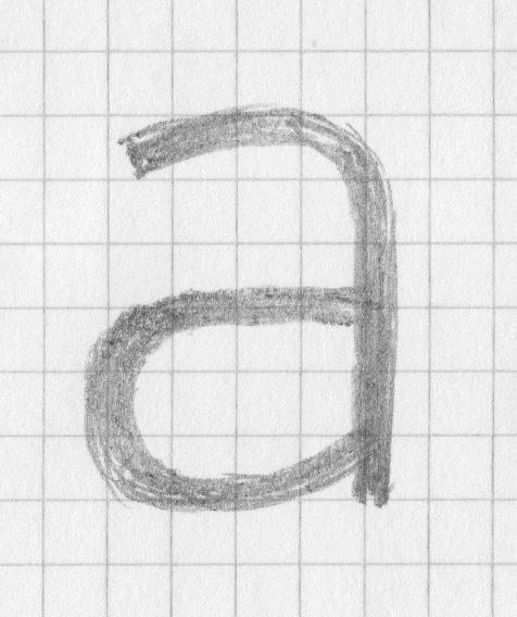
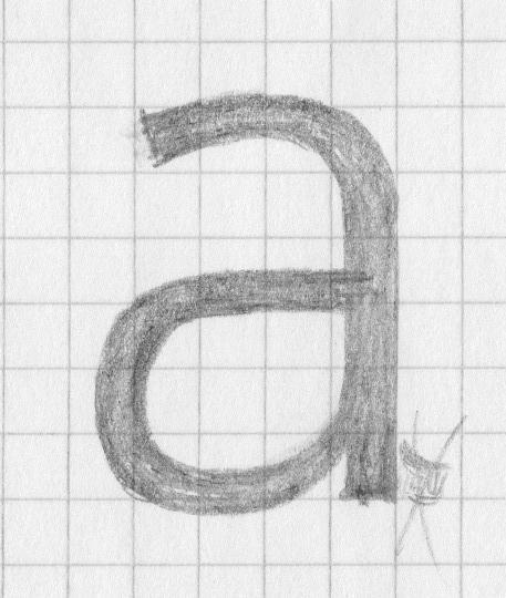
Is there an initial sketch, a scribble, a very first idea we can show to our readers?
Will the world ever need another typeface after the multitalented SST fonts?
“Yes, we certainly do need more variations, since there is no one-size-fits-all solution. When you need to describe your brand in a solid and clean tone, you may choose SST, but what about when the brand requires a more organic and friendly tone of voice? That’s where the alliance of Neue Frutiger/Frutiger families and Tazugane Gothic Japanese type can provide a good solution.
Tazugane Gothic was designed to match Neue Frutiger, while the SST Japanese family was created to work well with types with some solid look. So we now have two options for Japanese. This applies to other scripts as well – for humanistic sans in Arabic, we have Frutiger Arabic, and for a harder look, we have SST Arabic, for example.
As a Japanese-native type director, I have been asked many times to find a matching Japanese type to existing Latin typefaces. I believe that our two solutions – the SST and the Tazugane Gothic families – make it easier to select an appropriate tone of voice to convey messages in this multilingual environment.”
Danke sehr Akira, dass Sie Zeit für uns hatten.
Mit Akira Kobayashi sprach DESIGNBOTE-Redakteur Wolfgang Linneweber


0 Kommentare